44321 Darlington, Queen Elizabeth

44321 Darlington Road, Queen Elizabeth

Thursday, 18 March 2010

Evaluation 1 - In what ways does your media product use, develop or challenge forms and conventions of real media products?

Evaluation -

For my product I analysed a variety of examples of professional products, which were of the same genre as my own, so as to gain an understanding of forms and conventions used with that genre of music magazine. So in evaluation of my own product and how it challenges or develops the forms and conventions of a real media product, I am going to look at my own product in comparision to another or other professional magazine.

Front Cover -

Personal Product -
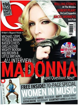
Professional Product - Q a well known British music magazine, is an ideal comparision to my own product as by institutional context, it is similair in how I would like to market and sell my own product to it's selected audience.
Image/Photo (s) -

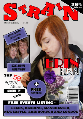
The image used in Q's magazine of the famous "Queen of Pop" Madonna, shows a certain coolness that could be attributed to the pose and mise-en-scene within the image, which is done in a mid shot. In my own image I have used a similair aspect to potray my artist, with them in a mid shot, dominating the right side of the page, clearly potraying their mise-en-scene within it. The image of Madonna used in Q is effective in how it contrasts appealingly with the other objetcs on the page, which I myself have tried doing, by using colours within the image or ones, which stand out nicely from it.

Layout -

The layout within the Q magazines front cover clearly shows that most of the objects on the page are focused to the right, bottom and slighty to the left so, as to leave the models face apparent through it all. In my own magazine I have done this to a degree myself, by placing objects to thge top, right and bottom, but leaving the left side of the page open, so my model is clearly defined.

Text & Font -

The use of text within the Q's magazine is very simplistic and only seems to use a few types of fonts in a small amount of colours, all contrasting and sticking to the colour scheme. In evaluation of my own front cover in comparison to Q's I find that I have used a small amount fonts for the main text including "Rockwell Extra Bold" as the main font, but use of variety of different texts in some cases, to create a heavy emphasise on some points. The actual text within the front page of Q's magazine, is based around what is inside the magazine and special attractions of the magazine are highlighted by use of special effects. My own product, does basically the same with the text on the front page, but also makes use of highlighting the special offers, being more of an incentive.

Colour -

Colour on the front page of Q is mainly red, black, white and blue, coincidentally three of the colours being that of the British flag, potraying who the magazine is targeted at, but there is also use of a gray colour to make it a focal point and to highlight its special offer. In Strain my own product for the front cover and even throughout the product, I myself use of palette of colours including red, blue, black, white and grey, with the blue acting as a highlighter for the special offers within the product. This is effective as it is bright and draws the readers attention, and being less jarring than a product which uses no particular colour palette, meaning it's more likely to be bought by a customer.

Special Effects -

The special effects used in Q is focused on the image as it makes it appear more crisp and appealing to the audience, this could be done by playing around with the contrast or brightness. With my own image on the front cover, I edited the shot, by increasing brightness and contrast to gain a more appealing picture which stands out, therefore being similair to Q's idea.

What did I do differently with my front cover -

My own product in the form of it's front cover, is different to Q's and many other of the like as it contains, a high amount of colour within the image, while many others are mainly made up of dark mise-en-scene and such, while with my own I use colour to stand out and potray my audience. The layout of my own product compared to others, is very much laid back in comparison to others, as their is a lot more emphasise on the images than the text.

Criticism of my product -

In criticism of my own work I find it to have a minimal amount of professionalism to t, but this could be due to the fact that my own version was a first for myself and I lack the experience the makers of Q have. I also see a small amount in my own front page, which I fidn slightly deteroriates the work, yet enhances the images attraction to the audience.

Contents Page -


Personal Product -

Professional Product -

Image/Photo (s) -

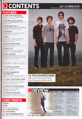
The use of images or photos within the contents page in Q magazine is very supportive of it's text and target anudience, such as through mise-en-scene which is mainly made up of dull flat colours, which are trademark of the rock or alternative genre. In my own product I have done a similair act, by incoporating a lot of black into my images through mise-en-scene, such as a leather coat. The main image on the page, that of the Courteeners dominates the right hand side of the page, making it a focal point of the contents page, therefore being a selling point. I have done this with my own image of my main act "Erin Finn", causing the audiences eye to be drawn there, like a real product would.

Layout -

The layout used by Q magazine as showed above is layed out so that the main image sits at the right side of the page, while text and objects surround it to the left, top and bottom, with a smaller image below. With my own magazines contents page I placed the images to the right side of the page so, as to keep the audience comfortable with the genre, as mine and Q's are simialair, yet i tried to push a lot more images into the product so as to appear more interesting.

Text & Font -

The text within Q's contents page is mainly made up of three fonts, with little change in size, even for the headers and such, this creates a laid back, but appealing product. With my own it is made up of many different fonts, all to create emphasise, or appear more appealing to the audience, yet the size in fonts in something that dosent drastically change within the page, like Q's. Colour of text within Q again is another thing which dosent change much, mainly being black, with slight colour here and there, a similair to my own in some ways, as the main body of text is black in colour.

Colour -

Little colour is used within the contents page of Q, with the main colour being derived from the image of the main act, with the little outside colour contrasting appealingly with the colour in the image. With my own product, plenty of colour is used, but most of it is flat, so as to draw attention to the images and certain aspects such as the special deals, this creates the belief that more is going on than actually is.

Special Effects -

With the Q magazine there dosen't seem to be any outstanding special effects used within the contents page, as the pictures seem simple in their construction. But special effects is usually used throughout magazines to create better, brighter pictures or outstanding effects, I myself have used it and increased brightness and contrast to create more appealing pictures, which grab the readers attention.

What did I do differently with my Contents Page -

With my Contents Page, what I did different was include like the front cover a lot of special offers or contest so as to continue appealing to my audience and to grab their attention. Another aspect I did differently within my product was the layout, which included all the pictures being put to one side, while more colour was also used, which is different to professionals as they tend to stick with neutral, bland colours.

Criticism -

What I could have done differently with my work and wish I did, was include a lot more effects with the text boxes and such, to make a more sophisticated appeal, while I would also have liked to have included a lot more text, so as to seem like there was more going on than actually was.

Double Page Spread -

Personal Product -


Professional Product -

Image/Photo (s) -

The image used in the professional DPS has been edited so that it is more crisp, cool and appealing to the audince, it also dominant of the right side of the DPS with great use of colour to become a focal point of the pages. I myself have done a similair act within my own magazine, by placing my own image to the left side of my DPS so that it becomes a dominant focal point within the product, drawing the attention of the reader, while I have also edited it to appear more bright and lively. The other image I used to the right side of the page; a smaller one, gives the readers of the product the feeling that they are getting an insight into the into the stars life as is it is a picture of the past.

Layout -

The layout of the professional DPS is coordinated around the colourful picture to the right of the page and the dominant heading, meaning that the text is pushed to a small space on the bottom of the left side of the DPS. With my own magazines DPS i decided to do a similair thing and use my image on the left of the page so that it would be one of the first things my audience saw when they turned over the page, but also so that the interview with the act could be placed on the other side of the page, so as to give the audience something vast in amount to read, unlike the professioanl product.

Tetx & Font -

The font of the text on the professional product is very dominant in its size and boldness, drawing the readers attention due to its black background, but the DPS seems to be made up of just two fonts, the headers and the body of texts. With my own doule page spread it is made up of a minimum of four texts so as to appear more exciting and draw attention to areas. A quote a used in the professional product, so as to get readers interested, as is done with my own.

Colour -

The colour used in the professional double page spread, is fairly neautral apart from the colourful use of the image, so as to draw attention to it, maybe potraying the act; Lilly Allens personality. The colour palette of my own DPS follows the trend of the other two pages so as stay neutral, but contrasts appealingly with the image and the personality behind the act, that of a rock star.

Special Effects -

Special effects used with the professional product seem to be on the image, so as to brighten it and make it stand out on the white page and grab the readers attention, therefore hooking them. My own product delievers such development as well, by the use of enhancing brightness and contrast to appear more appealing, just like my other images.

What did I do differently with my Double Page Spread -

With my own product, what I did differently was to use a snapshot of my act in the past so as to interest the reader and draw them in, I also used special offers such as a free poster of the act as an incentive to the reader, while still delivering a more pronounced amount of journalism.

Criticism -

In criticism of my magazines DPS, I wish I had included a few more images, so as to make the double page spread to appear more crazy in its appeal, while I would also have liked to have included more effects on the images so as to make them more surreal.

In evaluation of my own product I find that it follows a lot of the trends of the succesful magazines which appeal to my genre, yet includes more in the way of incentives so as to grab the attention of my readers.



Evaluation 2 - How does your media product represent particular social groups?

http://prezi.com/bin/preziloader.swf" type="application/x-shockwave-flash" allowfullscreen="true" allowscriptaccess="always" width="430" height="400" bgcolor="#ffffff" flashvars="prezi_id=6n86kxcmnxit&lock_to_path=1&color=ffffff&autoplay=no">

Evaluation 3 - What kind of media institution might distribute your media product and why?

Evaluation -
In evaluation of my final product "Strain", in comparison to others such as NME, Kerrang and Q; all magazines within my alternative genre, so I find that I stick to my idea that my magazine should be produced by a mass production company just as the examples are, by a company like IPC Media. The reason for my belief that my product could be produced as a mass product is due to the fact it contains mainly similarities with other magazines like Q, one reason being the use text within my product, within my product I include a variety of pieces of writing such as an interview, review, contents and front page one liners, just as a major magazine like Q (contents page, above.) would. Another reason for my belief that my magazine should be marketed as mass media, is due to that has such an expansive audience, it is not just targeting a small audience like indie magazines. Lastly another reason for my continual belief in my product being similair to that of ones such as Kerrang, is the physical similarities between the two, they use many of the same colours, such as the main being black and white, but red and blue as well, all within my product, they also use they same layout and similair looking images, which is shown in detail in evaluation one.


Why should it be a mass media magazine? -

Looking at my magazine I find that it contains a lot of the traits, within a mass media product such as -

- Well known act (Fictional)

- Large header

- Large gig listing

- Professional reviews

- Special offers

- Large amount of pages, according contents page
But of course, my magazine is not perfect in it's appeal as a professional mass produced magazine as my images may not be as great, due to less experience and resources. The front cover of my magazine may also be a point in which is a bit less professional look maybe due to the fact that I again dont have the experience that editors or such at professional magazines do, for them to create highly glossy and effective magazines.

Magazines similair to my own -

NME

Kerrang

Q


In evaluation in comparison to other magazines of simialir genre, I find that my magazine "Strain" is similair in many such as the audience, physical aspects, writing/journalism and use of images, so I believe it to be still marketable as a mass media product through such companies as IPC Media, who owns magazines above, all sucessfully defined magazines.


Evaluation 5 - How did you attract/address your audience?

For this evaulation 5, I again decided to use prezi.com.


Again, click on the hyperlinks above to access the prezi.

Within my product I used a variety of techniques and incentives to target my audience and to ensure their attention, these included content, the narrative and the character or act.

Content -

The content within my article is all based on the common trends of professional magazines aiming at similair target audiences and the feedback that I gained from my research into target audience. The use of competition, events listing and offers within my magazine was something highlighted within my focus group that I tried to put into use multiple times within the magazine, such as free posters and competitions for gig tickets to effectively target my audience. The use of bright colours within my product was another thing highlighted within my focus group that I placed into use by using a consistent palette of red, blue, white, black and grey, to keep the product lively. A moderate amount of images was another thng seen within my focus group and audience research as the audience felt in professional products, too much was going on and by reducing the amount of images they felt more comfortable.

Narrative -

Text within my product was placed throughout my product in high amounts to target and gain my audiences attention, one technique used was the use of music reviews, which gives readers an idea of what's a great new buy or blunder depending on its success. Interviews and a look in depth into the main acts life, is another techinique which I tried to use to target my audience as it gives something interesting for my readers to read and entertain themselves as they think they are getting to know their possibly favourite act a little better. The use of news and gigs within my magazine, targeted my audience, as it was something highlighted by them in my focus group that they would like to see in a magazine to keep on top of what festivals and such they could attend or wanted to go to.

Character -

Finally the character, was my last factor to target the audience with and I tried to use a variety of techniques seen within professional products and some of my own, such as the personality of the act being something the audience can relate to. By scripting or editing my piece of text on the double page spread I was able to make the text more applicable to my target audience by loking at the readers profile and trying to place a voice for that, which linked in with my great experience with English Language as an A level subject. Lastly my character applied to the genre of my product which was alternative rock, mainly through mise-en-scene, which placed a heavy emphasis on the clothes, which were common within that genre, such as the leather and their attitude, which was sort of inattentive as shown in the image.

How did I find my audience? -

To find my audience I conducted a series of audience research, including a variety of primary and secondary research so as to find a suitable audience for my product, this included a questionnaire, focus group and research conducted on teh internet. From the research I was able to find that my audience was inclinded to be that of the alternative genre, including the likes of Indie and Scene Kids, this was done by the collection of data to make pie charts and analysis of certain social groups and that in contrast to my reader profile.

Comments on Final Product -


To collect my final product comments I constructed a questionnaire as shown above, with some anwsers shown below, followed by some comments of my own on them.

Aaron Bamber (Age 17) - "It's a great example of colour, you've combined your use of colours throughout the magazine to represent the genre and stand out."

The use of colour, within my product, was something that I wanted to represent and embrace my genre in alternative rock, so by using colours which were bright yet some that were common throughout professional products, I thought I achieved this. The use of colour was something that was commented upon in my focus group conducted earlier in the audience research stage.


Jade Brown (Age 17) - "The image that you have used of the main act, I believe shows the genre that you have chosen, because the outfit and colour is very muted, something I would picture when thinking of alternative rock."


The idea for my model and the images, was to construct the mise-en-scene so that it presented a more sedated version or a combination of the many audiences within my initial alternative genre. I achieved this by looking at images of the groups within my the altrenative genre.


Matthew Watson (Age 17) - "You have used special offers like competitions and more for your money offers, which is you know, like professional magazines, like Kerrang."


By demand during the focus group conducted earlier in the year and ealier analysis of professional products, I decided to use special offers as an incentive to my highly recpetive audience and draw them in.

In evaluation with my product I tried to use the content, narrative and character to apply to my audience, by the use of audience research which listed many things which could be included within content and tried to link the narrative and character together by voice within the DPS text.

Evaluation 4 - Who would be the audience for your media product?

Evaluation -
The audience of my to my product I believe is to be targeted at the alternative genre, this a genre made up of multiple groups or tribes, consisting of emos, scene kids and indie kids. All of the tribes within the genre follow a common trend or factor with their choice of music, is that it is mainly made up of different types of rock, screamo for example. Bands within my genre could be "Paramore" "Panic at the Disco" "Flyleaf" or "Fall out Boy", which are commonly popular with nearly all th tribes within the genre. My target audience is made up people who are individual in their choices of music, not following the popularily publiscised acts of mainstream pop, hip and such, they are also passionate and dedicated in their likes and loves while also knowing what they want in a product. My genre is made up of both genders, but is mostly the younger generation, as the they are the only ones to really be open to the new types of genres within music, as can be seen on http://www.uktribes.com/.

A look at the tribes within the genre -

Scene Kid -

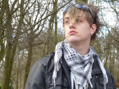
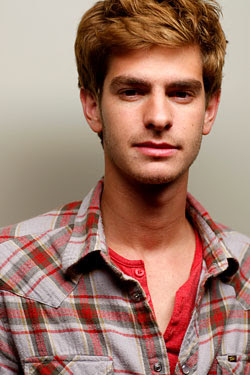
As seen within the images a scene kid, is a highly independent person, as is expressed by the exterior of the two models, potraying themselves as wholy a different person to anyone else. The fact that they are such an independent group within the genre, means that they need special attention, with special offers, images and so on that appeals to them as well as the rest of the alternative tribes I have highlighted. A scene kid is a greatly colourful and creative person, maybe expressing a factor that would appeal to them with a product they would consider reading, as I have included within my own product. The scene kid as a tribe is not completley seperate in their look or likes as they are in very much in many way similair to that of emos and such, due to their almost obsessive use of black within their clothes and as stated on uktribe.com they have similair music tastes, meaning that their tastes combined are easier to cater for.

Indie Kid -

The Indie kid within the alternative genre, is probably the most numerous as it is the least outstanding in its fashion stake, in comparison to emos and sceneo's, yet they are just as intense in their interest of the music within the genre with bands like "Coldplay" and such appealing to them as an audience. A indie is kid more laid back in their approach to life, maybe potraying the factor that will target them, as they maybe more interested in the content of the magazine or product rather than the layout which maybe more important to emos or such.
Emo -


Emo as a social tribe, are probably the most well known, predominantly as being depressed and upset youngsters, gaining its name from the word "emotional", they are well showcased tribe within the UK. An emo although being stereotyped in their behaviour are typically trying to appear an individual person, just as the scene kid would do themselves, also meaning they need to be catered towards, maybe by including different things which appeal to them as an audience such as lots of colour or lack of.
In evaluation my audience by analysis of my research into my reader are the alternative genre, consisting of emos, scene kids and indie kids, all with their unique sense of fashion, yet similair tests in music, following the trends of alternative rock. Different could be taken to target them all, being the use of colour, images and special offers, applying to them.


Evaluation 6 - What have you learnt about technologies from the process of constructing this product?

In reference to what I believe I have learned while working with the new technologies and such presented to me in my course, is a lot, from photography, file types and to different softwares such as indesign -

File types, File sizes & Resolutions -

During the process of my final product, I believe I have gained a lot of knowledge in the way files, such as the different file types like PDF's and Jpegs. The file type which I have gaine dthe most experience during the project would most probaly be the Jpeg, as it is a file format which makes a files data size smaller, maybe by flattening image such as on photoshop, so it is easy for a person export away from the computer such as on a memory stick or by email. The resolution or size of a file is something I have gained experience with, as the resolution is a good way to for a person working with software like photoshop to see their product in quality clarity, my understanding of it is, that it determines the amount of pixels used within certain measurement on the screen.

Photoshop -

During my experience within the final product, I believe that I have learnt a lot to do with photoshop, such as the ease with which an image can be placed within the format from another file and then be cut and edited to achieve the desired final image. The ease with which objects can placed anywhere on the page is another aspect of photoshop that amazes me, all you need to do is grab the object by its layer on the side of the page then move it to its desired position, another aspect of this could be the free transform tool, which allowed me to change the rotate and change the size of my objects easily. Another part of photoshop that I gained knowledge in was the use of effects such as drop shadows and strokes, so as to give text and objects more defined and professional look. I believe the use of photoshop as a software has been easier than I thought, due to the fact that photoshop is easily understood and creates a dramatic and clearly sophisticated product in the end, such as my front cover below, having its finishing touches put to it.


In design -

The use of indesign as a software, was at first admittedly very confusing, due to the fact that although it was similair to that of photoshop, the tools and such where in different places and were done in different ways, so indesign is definately something I have learned about. Particular things I have gained experience with indesign are editing, effects, images and the use of texts. Editing and effects within indesign were something that at first I couldnt find due to the different layout, but I found are easily done, by use of the tab image and then effects, so as to gain a effective, professional look. Placing images within indesign, is definately a lot more harder than photoshop due to that the images need to be copied or placed rather than dragged into place, but I found this created a definate size to the object, meaning it all fit together better. Placing and typing text within indesign was something I found difficult because, it all had to be written within a text box, rather than done anywhere to be placed randomly, it meant that like the images the text was within a different space and wasnt overlapping.

Photography -

While working on this final product I have learnt about photography, such as the different lightings, natrual and strong fake lighting being the most used by myself. Ligting within a shot is a key factor, because if a shot is to blurry, grainy or dark, it may not achieve its purpose of appealing to the audience, yet with great lighting, the lighting will mean more definition and that little description within the image is lost. Positioning of the camera is another key aspect of photography as it projects a certain message, such as a low angled shot looking up at someone with long shot will try to intimidate, this in conjunction with mise-en-scene as that also projects a message such as who the image is pushed at; the audience.

Blogspot -


Blogspot itself is something I have learnt from, as before I had never been or tried to get on a blog. It has taught me a lot in the way, of how to record my research and thoughts in detail, through the use of a seeable text for the teacher, even including images, presentations and charts, meaning it is something refer back to.


In evaluation I have gained a lot of experience during the time doing my final product, such as in files, photography, photoshop, indesign and blogspot.

Evaluation 7 - Looking back at your preliminary task, what do you feel you have learnt in the progression from it to the full product?

Evaluation -
Having a good look back at my preliminary task that I completed at the start of the year, in comparison to my newer product I find that there is a great difference between the two, with the final product obviously being the most professional and appealing to look at.

Prelim -


In comparison -

Special Effects & Image/Photo (s) -

The images within my prelim task, in most cases are evidently done in poor lighting or have had little thought put into their appearance or such. I believe that in my final product I have built upon this mistake and produced some better images, with the use of effects and lighting, also I believe in the later product that I had a longer time to plan the images and also put a lot of thought into them, so that in the end it achieved a better appearance. I think that with the factor of images in mind, in the time between my final product and my prelim task I have learnt a lot in the way, such as good lighting by use of fake and natrual, also I have become better adapted with the use of photoshop and such, due to the use of it in media and my other subject; graphical art.

Layout -

The layout within my preliminary task is very focused to minimalism, with little activity going on in eiter the front page or the contents page. This I believe is something which I have built upon due to personal experience, research with the focus group and more time, I have been able to perfect the layout so it represents that of a professional product. I believe considering the layout I have learnt many things since the prelim task, such as priortising objects so they attract the audiences attention, or to size objects correctly so as to achieve a professional look.

Text, Font & Colour (s) -

The fonts and text colour used within the prelim task are all mostly of the same size and quite boring in their presentation and not really suited to the idea of the magazine, which was to be a college magazine. The use of fonts, colour and sizing of the text is something I believe I have learnt since the prelim task at the start of the year, as I have analysed media texts I have developed the idea within myself that certain texts, colours and such suit a certain genre or idea, such as yellow being happy and probably suited to a childrens magazine. The text within a magazine, is something I believe to have gained skill within the past year due to media studies, this may due to my extensive analysis of media texts, but my comparison my final product and prelim shows this to be true, as with the final I have managed to pack it with appropriate text. Of course since the prelim I have learned to write as a journalist as shown in the DP, this is due to workshops with media, looking at professional products and my linked subject in english language.

In evalution I believe that during the time between the prelim and my finished final product I have gained a lot of experience in how to present a magazine, such as keeping in mind that you are always representing someone with a media text, how to layout a magazine, how fonts and colours represents certain things and how to write as a journalist.

Tuesday, 16 February 2010

Construction - Images

Images to be used in magazine -

Front Page -

1.

Rationale -

I have decided to use this image as the main front cover image due to the fact firstly the lighting of the image is great with little shadow showing, also the background is plain, meaning that it is more contollable and I can change the colour of it more easily. The clothing of the model within the image makes it a very contrasting image which will stand out more effectively on the front page to draw the reader eye. The positioning of the model within the shot is another bonus of the image as it means the model can sit to the side of the text and such and not be completley engulfed.

2.
Rationale -

I have decided upon this image as to potray an interview image, due to the closeness of the two models, potraying that aspect of an interview. The lighting of the image is quite high key on the models and nothing else making them the dominant focal points of the image as well as the models being centered within the shot emphasing their dominance.

Contents Page -

1.

Rationale -

I have chosen this image, due to the high key lighting, which is an important factor for this image while yet it projects the cool suave characteristic of my alternative genre. The positioning of the model within the shot is also a factor in my choice of the image, as it is obvious that she is the focal point of the image.

2.

Rationale -

I am using this image for the competition within my contents page, due to the fact that it is low lighting so as to subtly cloak the focal point with some shadow, yet keep the statue clear to the reader's eyes with the figure dominating the shot, through the use of a long shot.

Double Page Spread -

1.

Rationale -

I have chosen this image for my double page spread due to that it is a potrait image, therefore able to take up one side of the double page spread. But I have also decided upon this image as it posses the dark, moody vide which could be seen in alternative rock; my genre, therefore effectively drawing the audience in. The model's positioning within the frame also makes them the dominant item within the shot making them the focal point.

2.

Rationale -

This image is being used for the double page spread for a past photo due to the lighting which is very bright on the figures, something which suggest unprofessional photography and important to my article, as it is an image before the acts fame.


Thursday, 11 February 2010

Construction - Mast Heads


Construction - Article (Double Page Spread) First Draft

Article Write-Up –

Covering the music reviews of the media with one liner’s such as “Utter perfection” and “Simply amazing” the artist Erin Finn is no hermit from the media. Known as an artist for her outrageous behaviour and her silky song tone as she lulls an audience into a new atmosphere of false serenity; she is the new British alternative act to hit the charts. The Yorkshire born songstress; a mixture of her American counterparts Evanescence and Paramore, talks to us in an interview this week just before kicking off her debut sold out tour of Britain at the O2 Arena in London.

“So, Erin, how are you finding your new found fame as the newest rock star to come from the UK?”

Well, it’s quite unnerving at times, the amount of attention you get from the media; it’s crazy, I’ve had people hiding outside my house in the bushes, it’s really obvious they’re there, but they seem to think they’re in the army. The fans are great though, they always come up and say hi, it’s a great feeling but definitely different, I never expected the reaction I’ve got.

“How is it you came to be in the industry? What got you interested in music?”

It would have to be when I was little, I’ve always been interested in music to some degree; but I think it was with the school plays that really got me interested, the feeling I got when I was on stage it was just so intoxicating. Ever since I’ve done everything I could possibly do to be musical (laughs) including forcing my parents to drive me to every place possible in the area for music lessons, but it worked as you can see. Music is my life.

“Was there any artist when you were young that inspired you to become an artist yourself or commit yourself to the genre you are in now?”

Well, when I was young my mam was a really big fan of Queen, I grew up listening to them and I guess you could say they are my inspiration, because they had such talent it pushed me to commit myself, but as I’ve grown I think I’ve added more acts to my list of inspirations. But definitely Queen, their absolute legends!

“How hard was it for you as an aspiring artist to gain a fan base and a contract as an unsigned artist?”

I guess it is a distressing time for an artist as we do have to do a lot to get noticed and it’s such a physically exhausting time. I remember it for myself I feel bad for all the acts out there who still aren’t signed, going from one festival to another and getting dressed in the public toilet like I was its degrading, but I do think in the end it’s worth it, as to do what you love for a living it’s great.

“So you were born in Hull, did that introduce you in any way to music and your life now?”

Well I obviously had most of my music lessons in Hull, so partially it did as like I said before, I tried everything musically that I could. But when I was old enough half the time I ended up commuting to Newcastle and Leeds for gigs.

“So you’ve managed to establish yourself as an artist, how has it been? Any interesting stories from the time?”

Well I’ve had the crazy people hiding outside my house and I’ve had the few crazy fans, you know the type, which will run across a busy road, just for an autograph. I have been locked out of the theatre I was performing at by the bouncer that was quite crazy, he didn’t I was who I said I was (laughs).

“So you’re about to go on your tour, what is your expectations of it? Do you have any future plans after this tour that your fans can know about?”

To say I’m excited would be an understatement, but I can’t wait, definitely. Well for future plans, I am just finishing up on my new album, so that should be out soon, apart from that I’m not sure.

“Finally, is there any tips or advice you can give to the acts that would like to follow in your footsteps?”

Well I would have to say to make good use of the internet, sites like MySpace are great, as that is how I got picked up, but they definitely need to be persistent when trying to establish themselves as an artist and (laughs) they have to think positively.

Friday, 5 February 2010

Call Sheet

Character - Erin Finn (Main Act and Model)


Shooting Day (s) - 2, 3 and 4

Call Time - (ALL) 1.20 pm

Shooting Time - (ALL) 1.30 pm

Day/Date - (2) 10/2/10, (3) 13/2.10, (4) 10/2/10

Producer and Director - Aaron Horsfield


Actor - Dajana Palona

Character - Band Member of MaRXs

Shooting Day - 1

Call Time - 1.20pm

Shooting Time - 1.25pm

Day/Dates - 8/2/10


Director and Prouducer - Aaron Horsfield

Actor - Aaron Horsfield

Character - Interviewer


Shooting Day - 1

Call Time - 1.20pm

Shooting Time - 1.25pm

Day/Dates - 8/2/10

Director and Producer -Aaron Horsfield


Paragraph Planning

For my magazine in my double page spread I have decided that I would like to provide the audience with an interview, rather than an article on a specific acts gig or performance, I've decided to do this, so as to be seen an informative magazine that will provide the audience with a keen insight into the act. So I am going to plan the questions in which I am going to place in the article -

1. "So Erin Finn, how are you finding your new found fame as the newest rock star to come from the UK?"

2. "How is it that you came to be interested in this music as a job prospect or life ambition?"

3. "How hard was it for you as an aspiring artist to gain a fanbase and contract as a unsigned act?"

4. "Is there any acts when you were young that inspired you to become an artist or to join the genre in which you have?"

5. "So you were born in Hull, how did you find that? Did it introduce you to your life now?

6. "So you've been touring, how was the experience, got any future plans, that our audience could know about?

7. "You've managed to establish yourself as an artist, how has it been? Any stories or experiences that have been exciting?

8. "Finally, is there any tips or adivce you could give to acts out there reading this who might want to follow in your footsteps?"

Rationale -
The use of these questions within the article will the provide the audience with an entertaining insight into the act as it will introduce some topics that may be of interest to my musically interested audience. The questions used will provide the key aspects and idea behind my product that I discussed that I wanted my magazine to be both informative and entertaining; as these questions will be, giving the audience information which may be informative to them and an entertaining aspect in the way they are anwsered. The questions make use of the first and second person narrative perspective that I discussed before and will make the audience feel like a part of the interview and therefore keep them more interested in the product as a whole. The questions used here provide a factor, which my audience asked for which is to informed of upcoming events and gigs which has been adapted and placed into the questiond to keep them well informed and interested through the use of language rather than just the picture, which is the case in some magazines.

Thursday, 4 February 2010

Reece of Location

Studio, Reece -
Rationale -
I believe this location to be ideal for a location within some of my shots in the magazine, firstly due to the fact that it provides a plain white background which is key to my magazine as I will be able to control the colour of it through editing. The studio is also ideal as it provides key lighting to either side of the background, which will provide a high key image; perfect for the front cover of my magazine and the enviroment of the location is completley controllable by me as the director which may not be applicable factor within out-door locations. This location is also away from the public meaning their will be no distrubance to them or the shoot, meaning a more easyily done photo shoot and better pictures.

Forest/Party, Reece -
Rationale -
The wooded area pictured above is an ideal location as it provides a key aspect in my design which is the idea of a freeness which may appeal to an audience as through representation of their attitude (gathered through research). The wooded area above is ideal to my magazine as it provides key lighting which is not overbearing, meaning the model will not be lost, as may happen with many out-door locations due the sun's light as a backdrop. Another appeal of the location is that it is easily accessible by myself and the models, being only a short distanced walk from my house.
Stairs, Reece -

Rationale -
This location is ideal for the shoot due to the fact it projects a key aspect of my audiences behaviour which is solidarity and is shown here by the old wooden stairs and the fact the model will be peeking from behind the banister. The lighting within the area is great as it is not overbearing in light and the model will not be lost, but be enhanced through the use of natrual and kae lighting. The location is also easily accesible to myself and my models as it is at college and away from the public.
Art Centre, Reece -

Rationale -
For this image I was unable to take a picture within the art centre due to the amount of the public within the centre at the time, which also may be a problem with the location, but is easily controlled if the right day or time is chosen for the time. Apart from the flaw in the location before, the location is ideal as it provides within the art centre the key aspect of a comfortable looking enviroment, which is shown in this location by the presence of seats. The lighting within the location will be ideal as it will provide natrual and fake lighting in a managable balance which will not be over bearing to the models prescence within the shot. The location of this shot is also a very accessible place, just as the ones before due to it being right next doot to the college and being the place where our media studies lessons are held.

Initial Sketches

Mise-en-scene -

Article Planning

Purpose of my article -
The purpose of my magazine is to inform readers of upcoming events, new bands, exciting news yet to present it all in an entertaining way, which will grip the reader and make them want to come back for more. The magazine will include audiences and celebrities funny stories, jokes all for the enjoyment of the reader.

Narrative Voice (1st, 2nd or 3rd) -
For my narrative it is going to make use of 1st and 2nd person perspectives so as to build a better conversational relationship with the reader and make them feel like they know me and therefore will be more entertained and want to read more as a factor of this, while the use of third person can only be restricted to the acts and places mentioned and not to the reader as there is too many.

Style -
The style of the magazine will be a mixture of informal and formal language so as to build up a personal relationship with the reader, yet to project a sense of realism and professionalism through the use of formal language type in the big articles.

Language Use -
For my article in my double page spread I am going to do an interview as a majority of my dicourse within the magazine. My lexical choices in grammar will be very conversational so as to build relationship with the reader, i will also make use colloquial.

Wednesday, 3 February 2010

Photoshoot Plans

Studio, Plan -


Rationale -

I have chosen to place the model in front of the backdrop or screen so as to produce a highly lighted picture of my model, with a white or blanc background, so it is easy to do what I want with it. I'm going to use two lights to either side of the model as to work in sync with idea of a high key picture, with hardly any shadow. The camera will stick to the 180 degree rule, so as to produce a picture from a variety of angles.


Forest/Party, Plan -


Rationale -

I have chosen to place the model in a wooded party scene, so as to express the lively sound of alternative rock, except in natrual setting. The model will fluctuate in position depending on lighting and the different poses or position I would like them to be for the shoot. In influence of the last point, the camera will move depending on the models position. For the lighting in this shoot, the light will be natrual and derived from the sun, to give the image a gritty appeal.


Stairs (Banister), Plan (Possiblity) -


Rationale -

For this I wanted to produce a medium key image, with some mild shadowing with wooden background, to give the image a gritty effect like the last one. The model will be mostly stationary in this shoot, staying in one place for most of the shoot and only moving their upper body or face, so in influence of this the camera will also mostly be staionary, but may vary to give different angles. The lighting in this will be natrual with some fake due to it is indoors.

Art Centre/Window, Plan -

Rationale -

For this shoot I ahve chosen to do it in a comfortable looking area with confy seats and so fourth, to potray the feeling of an interview. The models will stand mostly staionary for the picture, as variation in picture is not really needed, hencefourth influencing the camera to be stationary also. The window is the background so as to provide some natrual, but so as to avoid the models being lost in light, the time of day will have to fairly early or late, or to have some mild weather.

Tuesday, 2 February 2010

Flat Plans

Front Cover -


Rationale -

For the front cover I decided to use a mid shot so as to introduce the act to the potential audience and to get them interested, by the dominance of the image on the front cover. The models natrual hair of red shall be edited so as to look brighter and in turn draw attention to the act whiel contrasting appealingly with the mise-en-scene of a purple T-Shirt to further do this. The header of "STRAIN" is placed at the top left hand corner in a bright variety of green so as to draw attention to the title because people read from left to right, yet the colour is mildy lost in comparison to the model, so as to make the act the focal point. The use of colour mainly blue and red for the added text and boxes on the front cover is done, so that they are all contrasting and keeping to the suave, crisp look of the magazine, which suits the audiences persona.

Contents Page -


Rationale -

The style of the contents page is reminescent of many other contents page, so is keeping the audience comfortable through familiarity yet is more eccentric through more use of colour, as other contents pages tend to have a plain white background. I am using a large picture of the main act so as to draw the reader in and to attract them to the page. The contents page will make use of incentives such as competitions and minor music revues so as to push the thought on the reader that the magazine is informative, as the contents page will usually be the second page the reader see's so has to force the thought onto them quickly. Following from the front page the colours of purple, blue and red will be continued on in the page, with the safe choice of black and white throughout to contrast it all.

Double Page Spread -


Rationale -

The layout of my double page spread is very laid back with only a minor use of colour so as to draw the readers attention to the act and information on the page, it is set out so that the act dominates one half of the double page spread, with the text taking most of other, yet with a smaller picture there to liven it up and reinforce the text. The mise-en-scene of the front page is carried on so as to keep the same contrasting colour pallete and not to be to fluctuated. A pull out quote will be used so as to attract the audience and make known what is the article is about and the use of text within this will be mutiple in choice so as to make an appealing effect. The colours on the double page spread like the other two will be made up mainly of purple, blue, red and with the use of black and white to contrast them.

Wednesday, 27 January 2010

Institutional Context

As I am creating this magazine on my own for a specific audience, it will have certain limitations, meaning that I will need to take on the jobs of production by myself, this includes, photographer, editor, journalist and so on. Production time for the magazine will be limited as I will be set and set myself a dealine for the finalisation of the product, yet in the real life instituion funding could be available from large companies such as "Bauer Media" which owns a large amount of successful magazines including "Q" and "Kerrang" another example of it would be "IPC Media" which owns "NME" another successful music magazine, directed at the rock genre. "Bauer Media" is an example of horizontal intergration as it has a variety of products or services over various media platforms such as TV, Music and Magazine, this will mean there would be knowledge and resources available for the production of a product. To target a larger company for publication would be a help in starting up a magazine as, they are more well known and therefore have more rescources, meaning that it would be easier for me to start the magazine and create a better end product, in comparison to an independent magazine which has limited resources. The aim of the larger companies as a whole is to make profit rather than for the love of the idea or product they are selling, therefore with the application of a larger company to produce my magazine, there may be less dedication to it than with an independent media institution. An example of a large magazine institution is "Bauer Media", they describe themselves as "Our business is built on influential media brands with millions of personal relationships with engaged readers and listeners. Our strategy is to connect audiences with excellent content through our broad multi-touch point brand platforms, wherever and whenever and however they want. Our wide portfolio of influential brands gives us advantages over pure play magazine or radio competitors." The publication of the product will usually be done by the ones doing the production, in this case bauer media. For the distribution of my product I would with the help of Bauer Media be able to distribute through the business"WWMD" (World Wide Magazine Distribution Ltd) which distributes for other music magazines of Bauer Media such as Kerrang, therefore the distribution of the product would be more successfully distributed across the country and be able to gain reputation as a greatly and quickly distributed product, therefore making it more popular. Finally the exhibition of my magazine "Strain" may be done through the help of small business if it is bought by small or independent businesses such as a newsagents, but to target my audience I would try and get it showcased with others of the genre, I would do this so as to test the popularity or the interest in the product. If or once the product is established as a relatively successful product, I would try to get largely successful business such as "Tesco" or "Sainsbury's" so as to to target a greater market, due to the popularity of those businesses.
In conclusion for the production and the publication of my magazine I would seek the help of Bauer Media so as to have the help of their resources to construct and build the product in to a succesful magazine targeted at the alternative group within music, for the distribution of the prodcuct I would use "WWMD" so as to have a quickly distributing business helping out, finally I would try to exhibit my products in small business first, once or if they established themselves I would seek to exhibit them in larger business or supermarkets.

Job Descriptions -

Editor - The job of an editor is a very notable one, involving overseeing the whole of the magazine, controlling and laying it out so that it achieves its purpose of appealing to someone, maybe through appropriate articles or images and such.

Publisher - A publisher ensures that all texts or articles within a magazine are writtin well and suit their purpose, they will also oversee their rights as a publisher within the organisation. They control theory how the product is going to be sold and who to and also ensuring everything is done on time.

Journalist - A journalist is a key aspect of a magazine as they write the articles within the magazines, may it be an interview or a one sided look at a music event or such.

Photographer - The photographer is in charge of taking the pictures for the magazine and also ensuring they maintain purpose, mostly through mise-en-scene, shot distance and angle.

Delivery person or company - The people in charge of delivering the magazine are to ensure that the product reaches it destination on time so as to reach the shelves quicker.

Mood Board


The choice of media extracts within this mood board are one's that are an insporation to me due to personal preference or owning to the genre in which I am aiming at with my magazine. The choice of images within the mood board are one that have pushed me to think of doing something similair for my own magazine. The variety of magazine logo's on the mood board are another inspiration for me as they are all well known rock magazines and express that greatly through their header or logo. The other choice of material are some of the things I would like to use in my own magazine, contents page and double page spread.

Tuesday, 26 January 2010

Proposal of Ideas

Magazine extract, for this task I intend to make a magazine extract including a Front Page, Contents Page and a Double Page Spread in Print format under the title of "Strain". My intended market is a market of 16-24 year olds who are interested in the Rock (Alternative) genre, comparitive to mainstream magazines such as Kerrang and NME as it seems to be a popular audience and genre to appeal to and is a personal interest of my own. The intention of my magazine extract will be to excite and cause compulsion in the audience to read my product through appealing images and text. The main technique I will use to provoke compulsion in the audience is through the use of exciting images which are appropriate to the genre, such as with mise-en-scene that is dark and reminescent of the common clothing seen within magazines within this genre, creating a sense of realism within the audience, causing them to feel comfortable with the magazine. To do this I will use models appropriate to the genre, who are linked to this genre, rather than dressing someone in clothes to make them seem so, yet remain without a sense of realism. While looking through my magazine extract I wish for the audience to have a feel of impatience pushing them on to read more of the magazine, due to the bold colours, use of pull-out quotes ande edgy images throughout the front page, contents page and double page spread which I plan to use. I want the extract to be appealing to my audience so to do this I am going to make good use of technical codes such as the positioning of the image to bring the front cover to the fore-front of my audiences attention. I feel my product will be popular with the audience as it follows a popular trend in rock magazines, yet offers a difference in the use of information (e.g. gigs, live events...) and brigther images (many of the images used in mainstream images dark) yet holding the fascination of the reader through technical codes, such as mise-en-scene and positioning.

Thursday, 21 January 2010

Target Audience Research

Target Audience Research
For my magazine idea I have decided upon doing a music magazine on alternative rock, which is focused on bands such as "Florence and the Machine" and is a particular interest of mine within the rock genre.
To make sure my product will appeal to my audience I am going to do some extensive research, in which I will analyse what my audience wants to see in the magazine. To collect this data I will need both qualitive and quantitive data, to do this I am going to conduct a questionnaire and will gather a group of people for a focus group were I will ask some questions to gain their feelings.

Secondary Research -
To establish some secondary research I decided to look at some current reader profiles from well known music magazines such as NME and Kerrang that I believed would apply to me and my own genre of magazine I have chosen to do, which is Rock a well known genre and greatly represented through magazine like Q.

Example Reader Profiles -
NME - http://www.ipcadvertising.com/resource/fd4e20nlh1xefkowjxdha4xu.pdf
I believed this reader profile to be particulary effective in it's use of information as it clearly displays the average age, average gender...etc yet even more with the application of what is their favourite shops, their favourite gadgets and so on. This reader profile I believe may be similair or apply to my magazine as the audience is that of a rock magazine and displays the characteristics that I see in my target audience such as wanting to look well dressed and to be well informed.
Kerrang - http://www.bauermedia.co.uk/Brands/Kerrang/
This reader profile is very limited in what it presents to the audience but it is effective in what it says as it clearly defines its audience and can therefore target it. I believe this reader profile may apply to my music magazine as "Individually minded, independent of thought and musically experienced, an audience defined by attitude, passion and loyalty."Representing traits I would believe to see in my own such as being indivually minded and not following other people in trends of music.
Q - http://www.bauermedia.co.uk/Brands/Q/
This profile like Kerrang is very limited in what it presents but clearly lists a reader profile which is effective in it's targeting of a persons personality. Q states it readers audience as being "Open minded experience seekers, the Q audience don’t define themselves by the music they listen to. Music is an important passion, but their love of music will never be to the detriment of their other passions, such as film, sport and comedy.". This may apply to my magazine as it states some characteristics that have been shown in my questionnaires such as the fact that the people dont define themselves by their choice of genre in music.

UK Tribes, and how they apply -
UK Tribes is a term used to describe the many social groups that make up the British public, particulary the younger generation; those more likely to be interested in music such as Chavs, Goths and Scene Kids. Through the use of the site http://www.uktribes.com/ I have analysed the list of tribes and decided that my target audience from secondary research is more pointed towards the alternative tribes including Emo's, Indie kids and Moshers. From further analyse within the UK Tribes, I believe my audience is more directly pointed towards Emo's due to their like for bands such as "Fall Out Boy" and "Panic! At The Disco", both bands that are interests of mine and inhabit the genre in which I look to aim at through my music magazine, they are typically grouped as punkish, suppressed characters, so this will be valuable information in targeting the specific audience.

Primary Research -
To do some secondary research I decided I needed to collect some qualitive and quantitive data through my own labour and decided upon the methods of a questionnaire which I would disperse within the college to collect information and focus group to collect some more detailed information focused more on feelings.

Focus Group -
For my focus group I decided upon holding a group with a range of people of the same age as my predicted target audience so as to gain their feelings and emotions from some extracts and what they thought a music magazine should include, so collecting qualitive research.

Showing extract 1 (First cover page from textual analysis) -
“What do you like about this extract, right here? What is it that grabs you and pulls you as an audience?
“The front cover has a good ratio of images and the colours are bright and catch your eyes, there is a lot of text which makes you want to read and there’s a pull-out quote, makes me want to read the interview and you wana know what they are thinking about”
“What would you change about the magazine cover and why?”
“Probably less text which makes it more dominant to the image, the image looks a little less good. The image is a bit boring in comparison to what it could be.”
“What do you think a rock magazine cover should include as I am going to do one of my own?”
“Free goods, Live coverage, of up-coming events and interviews from bands and new bands coming up, you know?”

Showing extract 2 (First contents page in textual analysis) -
“What do you like about this contents page as an extract?”
“The use of images which create an eye catching look, theirs not much writing on it which means you read it more and the font is bold so you can see the name of the artists and brings more attention again.”
“What would you change about this extract and why?”
“Well maybe have more colour and maybe the attachment text (captions) could be a little bigger, so it easier to read.”
“What do you think a rock magazine should include as I am going to do one of my own?”
“Maybe some competitions were you can win some CD’s or merchandise and good use of colour.”

Overall what I have collected from my focus group is that they would like to see images which apply to the genre and used to the advantage of the magazine as they want to have plently of colour within it. The use of text within the magazine should be a moderate amount so as not to detract from the image and the magazine itself. My focus group also informed me of their want for attachments such as live coverage and so fourth which may be very effective in targeting my audience and something they look for in magazine, so is highly useful data for when I'm making the magazine.

Questionnaire -

For my questionnaire I conducted it with twelve people, randomly giving the questionnaire in and outside the college to get a better feel for peoples perspectives yet mainly aiming at my predicted age group of about around 24 years or younger, yet I still gave some to an older audience as to compare the results and tastes and see if their is any similarities. The questionnaire was a followed -


Pie Charts -


Gender of Rock Audience -


Favourite Music Magazine -


The data shown here is very varied and may be helpful in making important descions such as the colour and the layout of the magazine and how it will be done as there is a majority in the female audience for rock/alternative rock and a majority of my audience was more interested in Kerrang as a reader over any of the others, which may mean there is certain factors of that magazine which appeal more to my audience than any of the others, this may link back with Kerrangs reader profile and may describe my own audience and who I need to push my magazine at.


Write Up and in Conclusion -


By analysis of my questionnaire, focus group and secondary data collected through reader profiles I have come to a conclusion that my audience is of the 16-24 year old and within the alternative tribes of the UK due to the high amount of people being in that age group from my questionnaire and some of the favourite bands listed being of that genre. This analysis that I have made will have a detrimental effect on the style of the magazine I shall create, one being the pictures I shall use within the magazine, as they have to be pictures which fit the genre and appeal to the audience with mise-en-scene and so on, so Iwill use this to create a dramaticlly appealing images for this audience. Another factor which is affected by he audience is the text and font within the magazine as like the image they will have to be ones commonly seen within magazines of this genre such as Kerrang which include a heavy emphasis on big fonts and black colouring. The content within the magazine which will be dramatically effected by the audience as their will be more want for news of up coming events and such, which will effect what is present on the front page and contents page, as well as the double page needing approiate lexis to suit the style. In conclusion the content of the magazine, colouring, text and image is affected by the predicted audience of the alternative tribe, within the age group of 16-24.


Reader Profile (Mine) -


An audince personlised by their music, yet individually minded in what they listen too; not being swayed by other's choices in taste. They are passionate and strong willed in character continually being dedicated to their music and well aware of what they want in a product.