Print (Magazine)
Analysis of similar sources or products
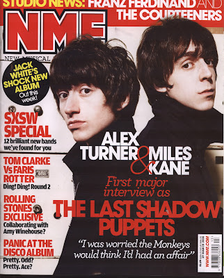
NME (example)
Form –
-Layout is reminiscent of a common magazine, with the picture in the middle or slightly to the right with the header and title above it and the text to the left, listing some of the exciting content within the magazine.
-Text is bold and stands out due to the colour red which is contrasting with the title, header and pictures bland naturalistic look gifting it with a bit of excitement.
Genre –
- NME magazine describes itself as a rock ’n’ roll magazine NME also says “...is the most iconic, valuable and essential weekly music magazine in the world, and is at the forefront of new music.” So the magazine is quite obviously appealing to quite large market, as many people like rock and with the many different styles of rock they have room to move out, such as with this cover which appeals to an indie audience.
- The genre of the magazine front cover is appealing to an indie rock audience with its simplistic nature, as the headliners on the magazine front cover The Last Shadow Puppets are described as a Indie Rock and Baroque Pop band and associated with other such bands such as the Arctic Monkeys and The Rascals.
Style -
- The front cover is very simple in design with little colour variety and quite similar fonts throughout, yet draws the reader’s attention with the contrast between the plain picture and the sharp bold lettering in red, forcing the picture to actually become the focus point as it stands out due to being so plain compared to the lettering which is very prominent.
- Mise-en-scene is simplistic with no colour, making the acts stand out and draw the reader’s attention with the contrast between their pale skin and dark hair,
Content – - Image (Headlining band), is used to draw the reader’s attention with a possibly interesting act.
- Title, brands the product, so if successful, readers are more likely to buy.
- Header
- Text, informs audience of some of the interesting content within the media text.
- Barcode
- Offers, is an incentive for readers to buy.
Technical Codes –
- Picture is edited so that it overlaps the title, trying to draw the reader’s attention to the act on the front cover.
- Picture has obviously been edited to give the picture a more simpler drab look that fits the style and genre of the article.
Fashion Rocks (Example)
Form –
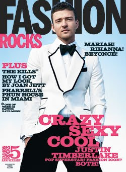
-Layout is different to a normal magazine in that there is a lot more dead space, accentuating the cool, crisp look of the magazine as it drags the attention to the text which when applied with style, stands out due to the boldness and the colours of the text (pink and black) which on the background of a sky and occasionally on the figure of Justin Timberlake stands out prominently .
- Text on the media extract is made up of just two colours and gifts it with a sophisticated edge as the cover itself is made up of only 5 main colours, so is not overwhelming the viewer with too much colour.
- The image is a low angled shot looking up at the figure of JT, as if the viewer is looking up in awe at him as the celebrity he is being used to appeal to the audience, probably girls to want to buy the product.
Genre -
- The genre of the cover seems to be that of a sophisticated outlook at major artists, as the mention of artists such as "Beyonce" and the image itself depicts. So the magazine could be said to appealing to a mass market, due to the prescene of hugely popular artists.
- As mentioned before the use of Justin Timberlake on the front cover could be said to be appealing to the market of young girls and teenagers as he is seen as an icon them.
- The product can be said to be tageted at a mass media audience as is obvious through the use of well known names, which are applied in this case as a means of attracting attention over other products.
Style -
- The front cover is very simplistic in design with little in the way of common magazine content, such as offers and a header at the top, again this adds to the careful and cool incentive of the magazine, which dosen't really appeal to any particular genre but to all as it is carefully inoffensive to all.
- The mise-en-scene of the image seems to be trying to appear cool with the use of a tuxedo and the background of a full blue sky, which may appeal to a big audience due to the commercialism of it.
- The range of text fonts within the media text are very similair as only two different types are being used, both complimentary and keeping to the sophisticated outlook of the cover which appeals to a mass market. Some text is placed out of line, adding an exciting edge which contrasts with cool, safe look of the magazine.
Content -
- Image is a highly known celebrity, appealing to a larger audience than some smaller magazines.
- Title, draws the viewers eye by contrast with the image and its background.
- Text, amde up of two fonts and colours attracts attention by standing out on the blue background.
- Colour, stands out and draws attention.
Techincal Codes -
- Images overlaps the title drawing express attention to the face, highlighting the fact that it is a major celebrity and therefore gaining the audiences attention as they may interest them.
Form -
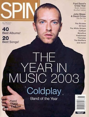
- The magazine cover is unusal as other magazine covers usually use a lot of text to cover up dead space within the picture, but this extract uses very little text, but yet this is very effective in making the figure of the article the main focal point and highlighting the fact that they are a well known celebrity, therefore pulling the audience in.
- The image is shot at the usual position for a magaizne cover by using a mid shot and having the figure in the center of the picture, more directly pulling the attention of the reader to the extract.
Genre -
- Spin the magazine in which the extract orginated is commonly seen as a rock magazine, appealing to that genre and the others within that, so is appealing to a very large market as it is a popular genre with all ages, but this particular product is seen as appealing to a more sedate or even indie audience due to the prescence of Coldplay's lead singer on the front cover.
- The image itself is appealing to a soft rock audience with the lack of activity on the front cover, such as the lack of text and the lack of colour or the little vaiety in text types, which gives the magazine a lazy look, which may appeal to more to the male audience as a reason of this.
- The colours of the media text I beleive specifically places it is a more male orientated product due to the colour choices of browns, black, white and pale blue, which are seen typically as more male colours while feminine colours include more brighter colours.
Style-
- The style of the extracts are very plain in comparison to other magazine front covers, this may be a reason of the fact that they are trying to potray an applicable scenario or story, or such as the heavy emphasis on the words written on the figures hand for "make trade fair.com" which may be a reason for the lack of colour and variety in text types and forms, as it is highlighting the figure and their cause, making it a focal point.
- Mise-en-scene again is very plain in clothing, this may due to the audience it applys to and a way in which the magazine can draw attention to the figure on the front cover, which is a highly known celebrity. The lack of colour in clothing also backs my point beforehand, of trying to emphasise the cause which is written on the figures hand as it clearly contrasts with clothing.
- The colours of the cover are very cool in brightness, this may be due to the makers are playing with the word "coldplay" emphasising their artist on the front cover.
Content -
- Image, highly known celebrity with no distractions; including a natrual background, emphasises them and their cause.
- Text to either side of the figure, fills in dead space, making the cover more appealing.
- Header, in centre of page over the figure again emphasises the figure as the readers eyes is drawn straight away to the contrasting colours of black and white.
- Title, done in similair colours as the background, so as not to draw attention from the figure, so when the reader is hooked they will then look at the brand.
- Barcode, gives a sense of realism to the product and that is realible.
Techincal Codes -
- Figure overlaps image is a highly used techinical code which makes the figure the focal point.
How has the Cover Pages Analysed encouraged my magazine -
- By use of colour, I have decided that my own work is going to be appealing, yet contrasting in colour to draw attention to or from a certain aspect of the cover.
- The application of mise-en-scene is key within a cover to attracting an audience, so to do so I have to pick the correct image.
- To create a sense of excitement I can use the differing text fonts and colours to create a certain aspect or emotion, that will be expressed through it.
Contents Page Analysis
Form -
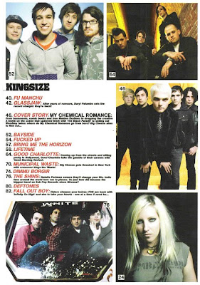
- The extract is very reminiscent of a contents page, yet very packed with little dead space, which is common in rock magazines as is evident by the use of bands such as "Fall Out Boy" and "My Chemical Romance", yet the packed information in a way applys to the audience as it potrays the music in itself which is very fast paced and loud and therefore may want the specific audience want to buy it.
- Images used are constant in the aspect that they all potray the specific genre which is rock, typically potrayed as either dark, pouty or having odd pictures (e.g. Fall Out Boy)the images are used to further draw the audience in after the front cover.
- Images are placed around the text in way which causes the text to become a focal point, whereupon the exciting information is highlighted in red and may further interest the reader with acts that interest them.
Genre -
- The magazine is obviously appealing to more of a rock audience due to the gritty pictures potraying an often seen atmosphere or aspect within rock pictures, also the acts on front are either rock acts or within that genre.
- The heavy emphasis on the colors black and red within the contents page, place it as a rock magazine due to they are trademark colours of a magazine of that genre, also potray the genres music which is often riddled with taboo subjects, therefore the colour black; a negative colour.
- The lack of physically appealing pictures such as airbrushed models, places the genre within a less commercial one and more towards rock.
Style -
- The style of the contents page is very dull apart from the text and pictures, due to the white background, which is plain, yet helps in making all the pictures stand out to the viewers eyes and making them contrast appealingly with one another.
- The text has been done in mainly two fonts and colours, this is done to stylize the page into emphasising the important parts or selling points within the media text. The text "Kingsize" within the extract is done in a font which in classic idealogy would appeal more to a rock view, or appear to be appealing more to that specific genre due to that it is very bold and slightly curved, usually seen within a rock magazine.
- Mise-en-scene within the images places the genre as rock due to heavy emphasis on black including hair and make-up, the trademark image of an act of this genre.
Content -
- Five Images, of well known bands which will interest the reader, if one of them is appealing to them.
- Header, in bold text makes it a focal point within media extract.
- Text, done in red and black to make it stand out on the white background.
- Number captions on images, pushes the readers to read onto a certain appealing story which may grab them.
Technical Codes -
- Pictures edited to give a grittier appearance that may appeal to the specific audience as it potrays their image.

Form -
- The layout of the extract is very compact with all the pictures and text pressed tightly together, this may done to make it seem more exciting and interesting to the reader as a way of making it seem like there is more going on than there actually is.
- The layout is very common for content pages of this genre as the text is placed to the left of the page with a large header at the top and pictures with number captions are placed around the rest of the page, this will reassure the reader to as which genre they are reading from, due to the fact that each type of magazine has its own layout; for example a glossy is less compact and will include a large picture probably with an airbrushed model.
- The background of the contents page is white as is common to draw attention to the attributes of the page, such as the bold text and colourful pictures which may be lost in a coloured background.
Genre -
- The genre of the extract is obviously placed in the bracket of rock due to the pictures of bands of that genre and the drums, which has the purpose of interesting the reader and pulling them onwards to read further.
- The colour and the boldness of the text, is of the rock genre as in many cases it is seen little anywhere else, as a commercial music magazine focused on safe music would be sedate in their appeal, using thinner text and probably more colour.
Style -
- The use of images within the media extract is very rock orintated due to four out six of them include a set of drums, commonly placed within the rock genre, but all of them are linked in the fact that they all include the gritty appeal of that genre with the acts placed stylishly placed within some scenario (e.g. Kooks, on beach).
- The colour of the text and captions within the extract, is made up of three colours orange, white and black, the later two being the most commonly used colours within magazines as they are neatral and stand out, but the orange is used a bridge between the two that contrasts appealingly with the images fits appealingly within the extract.
- The use of the variety of text fonts in the media text, makes the extract appear more exciting and introduces new subjects or makes headings stand out from the main of text, drawing the readers attention.
Content -
- Text caption at top, places the page as the content page.
- Header, done in bold black text, makes the text unusually the focal point of the page and informs the reader of the purpose of the extract.
- Images including coloured number captions, draws the reader in by showing some interesting stories and some well known acts within the genre and music world.
- Text, made up of orange, black and white, makes it stand out and done in a variety of fonts to introdude new subjects or segregate interesting words.
Technical Codes -
- Major image next to text is desaturated to highlight it above the other images as the focal point and possibly pull the readers in with the act being shown. It something seen a lot in the music genre as a means of segregating images above others.

Form -
- The layout of Q's magazines content page is unusual to others of the same genre due to the amount of images upon it, this difference of contents page may have the contations of the magazine trying to appear different and attract a different audience such as an older generation rather than a younger one, which many music magazines do.
- There is a lack of colour within the media extract, which is common within the extracts I have analysed, but this media text seems to be drawing the attention to the one significant image on the page. Conincidentally this is the most colourful aspect of the page, meaning they are heavily relying upon this image to be a selling point of the extract, suggesting that an image of a well known act, which has been highlighted within all the extracts, is important to a contents page and the audiences attention.
- The layout of the contents page is very compact with text to the top, left and bottom of the image which sits at the right hand side of the extract, the connotations of this could be that the reader will believe they are getting something well worth their attention due to that such a large space has been filled with the contents within the magazine, possibly meaning that to fill a contents page is an important aspect within it.
Genre -
- The genre of the magazine is heavily reliant upon the image and text as it has no commonly seen aspects within a music magazine of the rock genre, which Q as a magazine is known for, this is because there is no multitude of images and very little colour except the colour red. This could connote that Q is trying to apppear different to other magazines of the genre as stated before, but the use of the colour, usually linked with aspects such as power, could mean that they are trying to be the best music magazine to this genre and maybe others.
- The biggest image itself on the page is important to deriving the genre of the magazine, because the mise-en-scene for clothes is reliant upon the colour black which is seen a lot of the time in the pictures for rockstars or other acts of that genre and has become a trademark for them, yet the image is not appealing in the fashion of an airbrushed model or commercial artist, so it is evident that the audience for the magazine may be very different to other magazines and is trying to appeal to them, by feeling that the audience can link themselves with the artist in some way.
Style -
- The white background of the article, causes the red headings to become signifcant features within the media text and has the connotations that audience or reader is see's this reads and pushed on to read important aspects within the magazine, therefore becoming a selling point of the contents page. The text within this captions or headings is font common to music magazines, as it is digital looking and represents that aspect of music, that is now something technical.
- The colours of the page, mainly red, black and white but some light blue and gold are sparingly used, suggesting that the creators are trying not to take any attention away from the focal point within the media text, which would be the image, representing the genre in which it is targeting and suggesting to me that the attention of the reader may rest upon the image and who it is.
- The appearance of the extract is very safe, which may have the connotations that it is again trying to segregate itself from other music magazines, as not being jarring or confusing to look upon and rather something easily readable. The appearance of the media is also very professional projecting to the audience this aspect and informing them in a way, that they're different through text fonts which represent safety with ones times new roman, the most commonly used text font.
Content -
- Header, is done in black to not stand out, this emphasised through the use of white text, making it blend in, with the background, the little colour comes from the logo, which informs the audience of the brand and their interest of the product.
- Image, is the focal point within the text as it is the most colourful aspect within the extract.
- Text and captions, draw some attention by use of the colour red and pushed the reader to read more.
- Review text box, is offering something new to the audience again emphasising my idea of the magazine trying to appear different or appealing to an older audience within the rock genre.
Technical Codes -
- Text box, placed over image, draws attention as it interupts the colour and upon reading it, it may draw the audience in further because it may be an act of interest to them.
How has the Content Pages Analysed encouraged my magazine -
- The contents page has to be crazy in activity, so that when a reader looks at it, they are pulled in by the belief that there is more going than appears.
- The use of images is key to target an audience or encourage them to read on, as something uninteresting to them will make them want to put the magazine down.
- Use of colour is essential to enhance the activity within the contents page, yet has to contrast.
Double Spage Spread Analysis
Form -
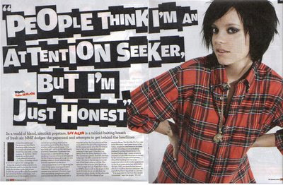
- The layout of the article is placed so that Lilly Allen; the main feature within the extract is dominating the right hand side of the double page spread with the use of a mid shot, a shot from the waist up, this has the connotations of revealing to the reader the sensibility or the attitude within the article which may be very strong willed. This is emphasised by the use of the picture of her dominating half the double page spread and projecting the image of attitude.
- The layout is also essential in projecting the attitude behind the media text because of the header/quote gained from within the body of text within the extract, which after the image, further dominates the double page spread even more so that it is emphasising the attitude or the feelings within that quote which expresses her attitude towards the media and what they think of her.
- The body of text within the extract is very small within the media text, this may be showcasng that Lilly is the important aspect within the double page spread and subconciously needs to be seen so by the reader and further highlighting the image and header.
Genre -
- What is revealed about the genre of the article is very obvious as being a NME article and the interview being with Lilly Allen, it could be said to be appealing to an audience of the younger generation or to a mass audience as Lilly is a commercial artist.
- The image used expresses a keen sense of negative attitude or sassiness as the mid shot of Lilly Allen bent forward could have the connotations of the younger people reading it being able to link themselves to the article through her attitude as many people may feel like they are showcased to all in some fashion which is not them.
Style -
- The use of lettering for the header/quote is very effective in that the black background to the varying sizes of white text makes the text become a focal point as it contrasts appealingly and interestingly with the image of Lilly as her hair under fake lighting and through editing, is a very dark black such as the image, therefore making the two aspects within the double page spread focal points. The varying sizes of the text of the quote, holds the readers attention as it is strange to do so and therefore is something the reader will be interested in looking at.
- The mise-en-scene within the double page spread is fantastic in catching the readers attention as it is the one of the few colourful aspects of the image as nearly all other colours used are neutral, meaning it is one of the first things seen on the page, drawing the attention to her. The colour of her clothes is also great in contrast with the colours used as it expresses a sense of attitude seen the image and quote. The make-up within the media text is used to make her very pale, emphasising my point that the clothes are the focal point within the image.
Content -
- Header/quote, draws attention due to boldness and attitude within it.
- Image, is the focal point and most colourful aspect expressing the key attitude within the double page spread.
- Text, is minimalistic, meaning it is not meant to be the focal point as the quote and image is used to grab the reader attention.
- Background, is white emphasising Lilly and the quote, making an interesting contrast.
Techincal Codes -
- Mid shot used for Lilly's image so that she is dominating the double page spread and is expressing the attitude within it.
- Editing, Lilly's hair appears darker and contrasts appealingly with the text.
- Mise-en-scene, is used so that Lilly become focal point through colourful clothes, while expressing the sensibilities of the attitude through the powerful colour of red.
Form -
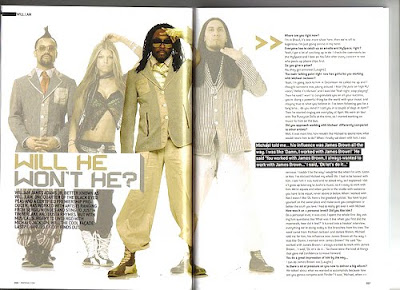
- The layout of the double page spread has been constructed so that the main focal point of the image Will.I.Am is dominating the intersection of the the extract with the use of a long shot to express the domination of the page as it is if he is intimidating the reader. His domination of the double page spread is emphasised as the other three acts of Black Eyed Peas are faded into the background, while he remains normal under fake lighting, more keenly emphasising him. The image itself expresses a certain amount of coolness or something to that degree, but projects to the reader his keen sense of attitude within the attitude, which is to appear cool.
- The layout of the extract includes a lot of dead space, which may have the connotations of that it is being more throughly used to make Will.I.Am the focus within the media text as the white background emphasises him and makes a more clear contrast.
- The text within the extract covers the right side of the double page spread, which unlike the extract before is a large amount and leads to emphasise the acts attitude of coolness, as expressing something of tha degree, through the amount said.
Genre -
- The genre of the article becomes evident through the use of the text and image and the mise-en-scene within it as both express a certain aspect of the genre which is along the lines of Hip Hop/Disco, this is shown in the image, by the clear Hip Hop clothes within the picture, such as the shoes, something trademarked to that genre as well as the suave yet relaxed outlook of all four acts, distinctly Will as his gold sweatpants express this idea. The digital text of the header is something which leads the reader to believe that the act belongs to their genre due to it represents the digital aspect of Disco that many would think of, when looking at it.
Style -
- The colours used within the double page extract are used so that all of them including gold and silver are ones that are contrasting with that of the four acts yet expressivily Will.I.Am, making it further clear that he is the focal point of the double page spread, leading the reader eyes more towards him than any other as this becomes clear to them.
- The text of the article particularly the header or title continues to represent the cool sauve appearence that is clearly expressed through the mise-en-scene within the image.
Content -
- Header/Title, is contrasting with the colours of Will.I.Am's clothes making it evident to all he is the focal point.
- Image, is edited so that Will.I.Am again is the focal point.
- Text, contrasts appealingly with th rest of the design so that it take no attention away from the main act.
- Background, is plain white, so that no attention is dragged from the focal point within the image and it's key attitude.
Technical Codes -
- Editing, image is faded so that Will.I.Am becomes the place in which readers are forced to look.
- Long shot, used to emphasise the cool exterior of the act, but allows the viewer to look at the act as if in awe.
- Mise-en-scene, with clothing expresses cool suave outlook of the band, particualarly Will.I.Am.
Form -
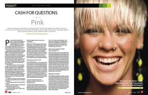
- The layout of the double page spread is done so that Pink; the act being the focal point of the article dominates the whole of the right hand page, so the mood of the extract becomes clearly evident through Pink's smiling happy face by the use of a medium close up, a shot which focues mainly on the face of the person being shot, this shows a sense of positiveness to the interview which may draw a reader in to read it, as it rare for it to be done in a music magazine and more suited to the aspect of a glossy or gossip magazine due to the cheerfulness of the representation.
- The layout of the double page spread is very cluttered so that there is little dead space, which stands out against the image of Pink, yet the text which covers the whole of the left side of the double page spread is written in a black font so as not to draw attention away from the image.
Genre -
- Unlike the other double page spreads the genre of this article is not clearly evident, suggesting that the magazine may be constructed to appeal to a mass audience rather than a smaller one, as with a smaller the text font which is here in this extract is quite sedate, yet in some other music magazines may be very suggestive of the aspect or genre of the article.
Style -
- The contrast between colours with the image and a certain amount of aspects with the double page spread make for an appealing layout or style which relys upon the green from the image and relays it to the top of the image through a few green squares or banners so that the bland white background, is not interupted by anything but the text, making it evident that the text is meant to be a focal point of the media text.
- The image includes a sense of mise-en-scene which relys just mainly on the face of the act to bring colour to the extract rather than the clothes, for example with the double page spread of Lilly Allen, the make-up of the image is very bright to encourage the cheerful attitude that gathered from the image, brightening the page.
Content -
- Title, introduces the act and encourages readers to read on.
- Image, is used to project a sense of happiness and friendliness through make-up, lighting and possibly editing.
- Text, is normal in font and colour, expressing that it is not trying to draw attention from the picture.
- Background, bland in colour so that no attention is drawn from the image.
- Banners, make use of the colour green to encourage the sense of positiveness within the article.
Technical Codes -
- Mise-en-scene, the lighting on the image enhances the sense of happiness within the double page spread. The colour green is applied throughout the article as a safe colour to continue the previous article.
- Medium Close Up, used to show Pinks face and enhance emotion shown.
How has the Double Page Spreads Analysed encouraged my magazine -
- The image is the key importance of the spread and must be made to be seen as so, so by use of editing and mise-en-scene, I will be able to achieve this as seen in the extracts.
- Big titles can be used to encourage the reader and is something I wish to make use of.
- The size of the text changes it effect on the readers attention, the smaller it is the less affect as seen in Lilly's extract and is something appliable to my magazine.
No comments:
Post a Comment