
Double Page Spread -


As you can see, the from my action plan above, in most cases I managed to stick to my action plan in most cases.
 Q a well known British music magazine, is an ideal comparision to my own product as by institutional context, it is similair in how I would like to market and sell my own product to it's selected audience.
Image/Photo (s) -
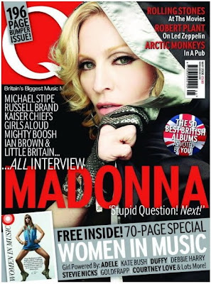
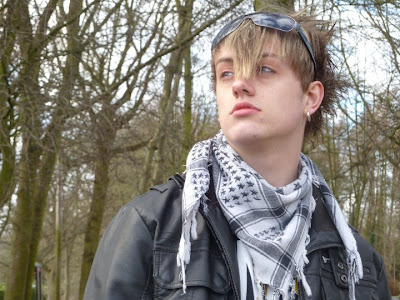
The image used in Q's magazine of the famous "Queen of Pop" Madonna, shows a certain coolness that could be attributed to the pose and mise-en-scene within the image, which is done in a mid shot. In my own image I have used a similair aspect to potray my artist, with them in a mid shot, dominating the right side of the page, clearly potraying their mise-en-scene within it. The image of Madonna used in Q is effective in how it contrasts appealingly with the other objetcs on the page, which I myself have tried doing, by using colours within the image or ones, which stand out nicely from it.
Layout -
The layout within the Q magazines front cover clearly shows that most of the objects on the page are focused to the right, bottom and slighty to the left so, as to leave the models face apparent through it all. In my own magazine I have done this to a degree myself, by placing objects to thge top, right and bottom, but leaving the left side of the page open, so my model is clearly defined.
Text & Font -
The use of text within the Q's magazine is very simplistic and only seems to use a few types of fonts in a small amount of colours, all contrasting and sticking to the colour scheme. In evaluation of my own front cover in comparison to Q's I find that I have used a small amount fonts for the main text including "Rockwell Extra Bold" as the main font, but use of variety of different texts in some cases, to create a heavy emphasise on some points. The actual text within the front page of Q's magazine, is based around what is inside the magazine and special attractions of the magazine are highlighted by use of special effects. My own product, does basically the same with the text on the front page, but also makes use of highlighting the special offers, being more of an incentive.
Colour -
Colour on the front page of Q is mainly red, black, white and blue, coincidentally three of the colours being that of the British flag, potraying who the magazine is targeted at, but there is also use of a gray colour to make it a focal point and to highlight its special offer. In Strain my own product for the front cover and even throughout the product, I myself use of palette of colours including red, blue, black, white and grey, with the blue acting as a highlighter for the special offers within the product. This is effective as it is bright and draws the readers attention, and being less jarring than a product which uses no particular colour palette, meaning it's more likely to be bought by a customer.
Special Effects -
The special effects used in Q is focused on the image as it makes it appear more crisp and appealing to the audience, this could be done by playing around with the contrast or brightness. With my own image on the front cover, I edited the shot, by increasing brightness and contrast to gain a more appealing picture which stands out, therefore being similair to Q's idea.
What did I do differently with my front cover -
My own product in the form of it's front cover, is different to Q's and many other of the like as it contains, a high amount of colour within the image, while many others are mainly made up of dark mise-en-scene and such, while with my own I use colour to stand out and potray my audience. The layout of my own product compared to others, is very much laid back in comparison to others, as their is a lot more emphasise on the images than the text.
Criticism of my product -
In criticism of my own work I find it to have a minimal amount of professionalism to t, but this could be due to the fact that my own version was a first for myself and I lack the experience the makers of Q have. I also see a small amount in my own front page, which I fidn slightly deteroriates the work, yet enhances the images attraction to the audience.
Contents Page -

Image/Photo (s) -
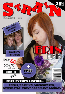
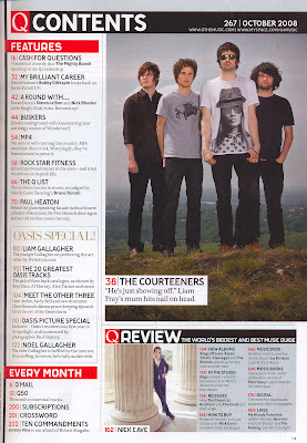
The use of images or photos within the contents page in Q magazine is very supportive of it's text and target anudience, such as through mise-en-scene which is mainly made up of dull flat colours, which are trademark of the rock or alternative genre. In my own product I have done a similair act, by incoporating a lot of black into my images through mise-en-scene, such as a leather coat. The main image on the page, that of the Courteeners dominates the right hand side of the page, making it a focal point of the contents page, therefore being a selling point. I have done this with my own image of my main act "Erin Finn", causing the audiences eye to be drawn there, like a real product would.
Layout -
The layout used by Q magazine as showed above is layed out so that the main image sits at the right side of the page, while text and objects surround it to the left, top and bottom, with a smaller image below. With my own magazines contents page I placed the images to the right side of the page so, as to keep the audience comfortable with the genre, as mine and Q's are simialair, yet i tried to push a lot more images into the product so as to appear more interesting.
Text & Font -
The text within Q's contents page is mainly made up of three fonts, with little change in size, even for the headers and such, this creates a laid back, but appealing product. With my own it is made up of many different fonts, all to create emphasise, or appear more appealing to the audience, yet the size in fonts in something that dosent drastically change within the page, like Q's. Colour of text within Q again is another thing which dosent change much, mainly being black, with slight colour here and there, a similair to my own in some ways, as the main body of text is black in colour.
Colour -
Little colour is used within the contents page of Q, with the main colour being derived from the image of the main act, with the little outside colour contrasting appealingly with the colour in the image. With my own product, plenty of colour is used, but most of it is flat, so as to draw attention to the images and certain aspects such as the special deals, this creates the belief that more is going on than actually is.
Special Effects -
With the Q magazine there dosen't seem to be any outstanding special effects used within the contents page, as the pictures seem simple in their construction. But special effects is usually used throughout magazines to create better, brighter pictures or outstanding effects, I myself have used it and increased brightness and contrast to create more appealing pictures, which grab the readers attention.
What did I do differently with my Contents Page -
With my Contents Page, what I did different was include like the front cover a lot of special offers or contest so as to continue appealing to my audience and to grab their attention. Another aspect I did differently within my product was the layout, which included all the pictures being put to one side, while more colour was also used, which is different to professionals as they tend to stick with neutral, bland colours.
Criticism -
What I could have done differently with my work and wish I did, was include a lot more effects with the text boxes and such, to make a more sophisticated appeal, while I would also have liked to have included a lot more text, so as to seem like there was more going on than actually was.
Double Page Spread -
Personal Product -

Professional Product -
Image/Photo (s) -
The image used in the professional DPS has been edited so that it is more crisp, cool and appealing to the audince, it also dominant of the right side of the DPS with great use of colour to become a focal point of the pages. I myself have done a similair act within my own magazine, by placing my own image to the left side of my DPS so that it becomes a dominant focal point within the product, drawing the attention of the reader, while I have also edited it to appear more bright and lively. The other image I used to the right side of the page; a smaller one, gives the readers of the product the feeling that they are getting an insight into the into the stars life as is it is a picture of the past.
Layout -
The layout of the professional DPS is coordinated around the colourful picture to the right of the page and the dominant heading, meaning that the text is pushed to a small space on the bottom of the left side of the DPS. With my own magazines DPS i decided to do a similair thing and use my image on the left of the page so that it would be one of the first things my audience saw when they turned over the page, but also so that the interview with the act could be placed on the other side of the page, so as to give the audience something vast in amount to read, unlike the professioanl product.
Tetx & Font -
The font of the text on the professional product is very dominant in its size and boldness, drawing the readers attention due to its black background, but the DPS seems to be made up of just two fonts, the headers and the body of texts. With my own doule page spread it is made up of a minimum of four texts so as to appear more exciting and draw attention to areas. A quote a used in the professional product, so as to get readers interested, as is done with my own.
Colour -
The colour used in the professional double page spread, is fairly neautral apart from the colourful use of the image, so as to draw attention to it, maybe potraying the act; Lilly Allens personality. The colour palette of my own DPS follows the trend of the other two pages so as stay neutral, but contrasts appealingly with the image and the personality behind the act, that of a rock star.
Special Effects -
Special effects used with the professional product seem to be on the image, so as to brighten it and make it stand out on the white page and grab the readers attention, therefore hooking them. My own product delievers such development as well, by the use of enhancing brightness and contrast to appear more appealing, just like my other images.
What did I do differently with my Double Page Spread -
With my own product, what I did differently was to use a snapshot of my act in the past so as to interest the reader and draw them in, I also used special offers such as a free poster of the act as an incentive to the reader, while still delivering a more pronounced amount of journalism.
Criticism -
In criticism of my magazines DPS, I wish I had included a few more images, so as to make the double page spread to appear more crazy in its appeal, while I would also have liked to have included more effects on the images so as to make them more surreal.
In evaluation of my own product I find that it follows a lot of the trends of the succesful magazines which appeal to my genre, yet includes more in the way of incentives so as to grab the attention of my readers.
title on, use this hyperlink to access prezi.com presentation for Evaluation 2
For this this evaluation I have decided to anwser my evaulation of how does my product represent my selected social group by using prezi.com
Who does the product represent? -
Alternative
- Emo
- Mosher
- Indie
- Scene kid
Detailed look at how they are represented -
Mise-en-scene and image -
The use of images and obviously the mise-en-scene along with them, I believe represents my audience quite well, as the model used is wearing appropraite clothes such as a leather coat to potray the vast fashions within alternative rock. The images I think shows my audience to be a clearly defined, fashionable and creative personality, something I believe my audience as stated in the reader profile.
Colour -
The colour I used for my product effectively represents my audience as they are a great contrast of flat dull colours and bright sharp colours such as red and grey/blue as seen in my product. This apsect is seen clearly in what my audience wears, such as dark colours, yet brightened up with the use of bright top or accessories.
Layout -
Layout of my product I believe represents my audience as it is jam packed with information and colour such as on the contents page, were there is a wide variety of things, pushed together, which is clearly seen in other products trying to target a similair audience to mine, such as "NME".
Offers -
Offers I believe are something which define my audience, as from the information I gained from my reader research, I heard that they would appreciate free offers such as competitions and posters within the magazine, which I myself have used at least once on each page to represent them and thier wants.
In evalution my product makes use of mise-en-scene/image, colour, layout and offers to effectively target and represent my audience which are of an alternative genre, including groups such as emo and indie. To gain an idea of how to represent them, I did extensive research of secondary and primary nature, to see who they were as a person and what they wanted in a magazine.
 In evaluation of my final product "Strain", in comparison to others such as NME, Kerrang and Q; all magazines within my alternative genre, so I find that I stick to my idea that my magazine should be produced by a mass production company just as the examples are, by a company like IPC Media. The reason for my belief that my product could be produced as a mass product is due to the fact it contains mainly similarities with other magazines like Q, one reason being the use text within my product, within my product I include a variety of pieces of writing such as an interview, review, contents and front page one liners, just as a major magazine like Q (contents page, above.) would. Another reason for my belief that my magazine should be marketed as mass media, is due to that has such an expansive audience, it is not just targeting a small audience like indie magazines. Lastly another reason for my continual belief in my product being similair to that of ones such as Kerrang, is the physical similarities between the two, they use many of the same colours, such as the main being black and white, but red and blue as well, all within my product, they also use they same layout and similair looking images, which is shown in detail in evaluation one.
To find my audience I conducted a series of audience research, including a variety of primary and secondary research so as to find a suitable audience for my product, this included a questionnaire, focus group and research conducted on teh internet. From the research I was able to find that my audience was inclinded to be that of the alternative genre, including the likes of Indie and Scene Kids, this was done by the collection of data to make pie charts and analysis of certain social groups and that in contrast to my reader profile.

The use of colour, within my product, was something that I wanted to represent and embrace my genre in alternative rock, so by using colours which were bright yet some that were common throughout professional products, I thought I achieved this. The use of colour was something that was commented upon in my focus group conducted earlier in the audience research stage.
Jade Brown (Age 17) - "The image that you have used of the main act, I believe shows the genre that you have chosen, because the outfit and colour is very muted, something I would picture when thinking of alternative rock."
The idea for my model and the images, was to construct the mise-en-scene so that it presented a more sedated version or a combination of the many audiences within my initial alternative genre. I achieved this by looking at images of the groups within my the altrenative genre.
Matthew Watson (Age 17) - "You have used special offers like competitions and more for your money offers, which is you know, like professional magazines, like Kerrang."
By demand during the focus group conducted earlier in the year and ealier analysis of professional products, I decided to use special offers as an incentive to my highly recpetive audience and draw them in.
In evaluation with my product I tried to use the content, narrative and character to apply to my audience, by the use of audience research which listed many things which could be included within content and tried to link the narrative and character together by voice within the DPS text.

 In design -
The use of indesign as a software, was at first admittedly very confusing, due to the fact that although it was similair to that of photoshop, the tools and such where in different places and were done in different ways, so indesign is definately something I have learned about. Particular things I have gained experience with indesign are editing, effects, images and the use of texts. Editing and effects within indesign were something that at first I couldnt find due to the different layout, but I found are easily done, by use of the tab image and then effects, so as to gain a effective, professional look. Placing images within indesign, is definately a lot more harder than photoshop due to that the images need to be copied or placed rather than dragged into place, but I found this created a definate size to the object, meaning it all fit together better. Placing and typing text within indesign was something I found difficult because, it all had to be written within a text box, rather than done anywhere to be placed randomly, it meant that like the images the text was within a different space and wasnt overlapping.
 Photography -
 While working on this final product I have learnt about photography, such as the different lightings, natrual and strong fake lighting being the most used by myself. Ligting within a shot is a key factor, because if a shot is to blurry, grainy or dark, it may not achieve its purpose of appealing to the audience, yet with great lighting, the lighting will mean more definition and that little description within the image is lost. Positioning of the camera is another key aspect of photography as it projects a certain message, such as a low angled shot looking up at someone with long shot will try to intimidate, this in conjunction with mise-en-scene as that also projects a message such as who the image is pushed at; the audience.
Blogspot -
Blogspot itself is something I have learnt from, as before I had never been or tried to get on a blog. It has taught me a lot in the way, of how to record my research and thoughts in detail, through the use of a seeable text for the teacher, even including images, presentations and charts, meaning it is something refer back to.

In evaluation I have gained a lot of experience during the time doing my final product, such as in files, photography, photoshop, indesign and blogspot.
Prelim -


In comparison -
Special Effects & Image/Photo (s) -
The images within my prelim task, in most cases are evidently done in poor lighting or have had little thought put into their appearance or such. I believe that in my final product I have built upon this mistake and produced some better images, with the use of effects and lighting, also I believe in the later product that I had a longer time to plan the images and also put a lot of thought into them, so that in the end it achieved a better appearance. I think that with the factor of images in mind, in the time between my final product and my prelim task I have learnt a lot in the way, such as good lighting by use of fake and natrual, also I have become better adapted with the use of photoshop and such, due to the use of it in media and my other subject; graphical art.
Layout -
The layout within my preliminary task is very focused to minimalism, with little activity going on in eiter the front page or the contents page. This I believe is something which I have built upon due to personal experience, research with the focus group and more time, I have been able to perfect the layout so it represents that of a professional product. I believe considering the layout I have learnt many things since the prelim task, such as priortising objects so they attract the audiences attention, or to size objects correctly so as to achieve a professional look.
Text, Font & Colour (s) -
The fonts and text colour used within the prelim task are all mostly of the same size and quite boring in their presentation and not really suited to the idea of the magazine, which was to be a college magazine. The use of fonts, colour and sizing of the text is something I believe I have learnt since the prelim task at the start of the year, as I have analysed media texts I have developed the idea within myself that certain texts, colours and such suit a certain genre or idea, such as yellow being happy and probably suited to a childrens magazine. The text within a magazine, is something I believe to have gained skill within the past year due to media studies, this may due to my extensive analysis of media texts, but my comparison my final product and prelim shows this to be true, as with the final I have managed to pack it with appropriate text. Of course since the prelim I have learned to write as a journalist as shown in the DP, this is due to workshops with media, looking at professional products and my linked subject in english language.In evalution I believe that during the time between the prelim and my finished final product I have gained a lot of experience in how to present a magazine, such as keeping in mind that you are always representing someone with a media text, how to layout a magazine, how fonts and colours represents certain things and how to write as a journalist.

I have decided to use this image as the main front cover image due to the fact firstly the lighting of the image is great with little shadow showing, also the background is plain, meaning that it is more contollable and I can change the colour of it more easily. The clothing of the model within the image makes it a very contrasting image which will stand out more effectively on the front page to draw the reader eye. The positioning of the model within the shot is another bonus of the image as it means the model can sit to the side of the text and such and not be completley engulfed.
2. 
Rationale -
I have decided upon this image as to potray an interview image, due to the closeness of the two models, potraying that aspect of an interview. The lighting of the image is quite high key on the models and nothing else making them the dominant focal points of the image as well as the models being centered within the shot emphasing their dominance.
Contents Page -
1.
I have chosen this image, due to the high key lighting, which is an important factor for this image while yet it projects the cool suave characteristic of my alternative genre. The positioning of the model within the shot is also a factor in my choice of the image, as it is obvious that she is the focal point of the image.
2.

Rationale -
I am using this image for the competition within my contents page, due to the fact that it is low lighting so as to subtly cloak the focal point with some shadow, yet keep the statue clear to the reader's eyes with the figure dominating the shot, through the use of a long shot.
Double Page Spread -
1. 
Rationale -
I have chosen this image for my double page spread due to that it is a potrait image, therefore able to take up one side of the double page spread. But I have also decided upon this image as it posses the dark, moody vide which could be seen in alternative rock; my genre, therefore effectively drawing the audience in. The model's positioning within the frame also makes them the dominant item within the shot making them the focal point.
2. 
Rationale -
This image is being used for the double page spread for a past photo due to the lighting which is very bright on the figures, something which suggest unprofessional photography and important to my article, as it is an image before the acts fame.

Shooting Day (s) - 2, 3 and 4
Call Time - (ALL) 1.20 pm
Shooting Time - (ALL) 1.30 pm
Day/Date - (2) 10/2/10, (3) 13/2.10, (4) 10/2/10
Producer and Director - Aaron Horsfield

Actor - Dajana Palona
 Character - Band Member of MaRXs
Shooting Day - 1
Call Time - 1.20pm
Shooting Time - 1.25pm
Day/Dates - 8/2/10

Director and Prouducer - Aaron Horsfield


I have chosen to place the model in front of the backdrop or screen so as to produce a highly lighted picture of my model, with a white or blanc background, so it is easy to do what I want with it. I'm going to use two lights to either side of the model as to work in sync with idea of a high key picture, with hardly any shadow. The camera will stick to the 180 degree rule, so as to produce a picture from a variety of angles.
Forest/Party, Plan -

Rationale -
I have chosen to place the model in a wooded party scene, so as to express the lively sound of alternative rock, except in natrual setting. The model will fluctuate in position depending on lighting and the different poses or position I would like them to be for the shoot. In influence of the last point, the camera will move depending on the models position. For the lighting in this shoot, the light will be natrual and derived from the sun, to give the image a gritty appeal.
Stairs (Banister), Plan (Possiblity) -

Rationale -
For this I wanted to produce a medium key image, with some mild shadowing with wooden background, to give the image a gritty effect like the last one. The model will be mostly stationary in this shoot, staying in one place for most of the shoot and only moving their upper body or face, so in influence of this the camera will also mostly be staionary, but may vary to give different angles. The lighting in this will be natrual with some fake due to it is indoors.
Art Centre/Window, Plan -

Rationale -
For this shoot I ahve chosen to do it in a comfortable looking area with confy seats and so fourth, to potray the feeling of an interview. The models will stand mostly staionary for the picture, as variation in picture is not really needed, hencefourth influencing the camera to be stationary also. The window is the background so as to provide some natrual, but so as to avoid the models being lost in light, the time of day will have to fairly early or late, or to have some mild weather.

Rationale -
For the front cover I decided to use a mid shot so as to introduce the act to the potential audience and to get them interested, by the dominance of the image on the front cover. The models natrual hair of red shall be edited so as to look brighter and in turn draw attention to the act whiel contrasting appealingly with the mise-en-scene of a purple T-Shirt to further do this. The header of "STRAIN" is placed at the top left hand corner in a bright variety of green so as to draw attention to the title because people read from left to right, yet the colour is mildy lost in comparison to the model, so as to make the act the focal point. The use of colour mainly blue and red for the added text and boxes on the front cover is done, so that they are all contrasting and keeping to the suave, crisp look of the magazine, which suits the audiences persona.
Contents Page -

The style of the contents page is reminescent of many other contents page, so is keeping the audience comfortable through familiarity yet is more eccentric through more use of colour, as other contents pages tend to have a plain white background. I am using a large picture of the main act so as to draw the reader in and to attract them to the page. The contents page will make use of incentives such as competitions and minor music revues so as to push the thought on the reader that the magazine is informative, as the contents page will usually be the second page the reader see's so has to force the thought onto them quickly. Following from the front page the colours of purple, blue and red will be continued on in the page, with the safe choice of black and white throughout to contrast it all.
Double Page Spread -

Rationale -
The layout of my double page spread is very laid back with only a minor use of colour so as to draw the readers attention to the act and information on the page, it is set out so that the act dominates one half of the double page spread, with the text taking most of other, yet with a smaller picture there to liven it up and reinforce the text. The mise-en-scene of the front page is carried on so as to keep the same contrasting colour pallete and not to be to fluctuated. A pull out quote will be used so as to attract the audience and make known what is the article is about and the use of text within this will be mutiple in choice so as to make an appealing effect. The colours on the double page spread like the other two will be made up mainly of purple, blue, red and with the use of black and white to contrast them.


