For my product I analysed a variety of examples of professional products, which were of the same genre as my own, so as to gain an understanding of forms and conventions used with that genre of music magazine. So in evaluation of my own product and how it challenges or develops the forms and conventions of a real media product, I am going to look at my own product in comparision to another or other professional magazine.
Front Cover -
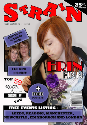
Personal Product -
Professional Product -
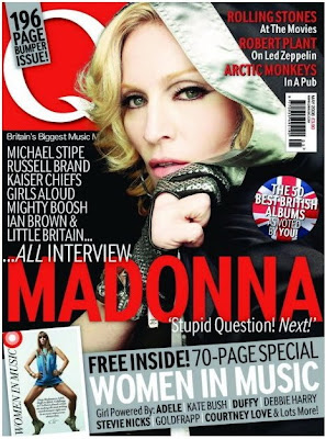 Q a well known British music magazine, is an ideal comparision to my own product as by institutional context, it is similair in how I would like to market and sell my own product to it's selected audience.
Image/Photo (s) -
The image used in Q's magazine of the famous "Queen of Pop" Madonna, shows a certain coolness that could be attributed to the pose and mise-en-scene within the image, which is done in a mid shot. In my own image I have used a similair aspect to potray my artist, with them in a mid shot, dominating the right side of the page, clearly potraying their mise-en-scene within it. The image of Madonna used in Q is effective in how it contrasts appealingly with the other objetcs on the page, which I myself have tried doing, by using colours within the image or ones, which stand out nicely from it.
Layout -
The layout within the Q magazines front cover clearly shows that most of the objects on the page are focused to the right, bottom and slighty to the left so, as to leave the models face apparent through it all. In my own magazine I have done this to a degree myself, by placing objects to thge top, right and bottom, but leaving the left side of the page open, so my model is clearly defined.
Text & Font -
The use of text within the Q's magazine is very simplistic and only seems to use a few types of fonts in a small amount of colours, all contrasting and sticking to the colour scheme. In evaluation of my own front cover in comparison to Q's I find that I have used a small amount fonts for the main text including "Rockwell Extra Bold" as the main font, but use of variety of different texts in some cases, to create a heavy emphasise on some points. The actual text within the front page of Q's magazine, is based around what is inside the magazine and special attractions of the magazine are highlighted by use of special effects. My own product, does basically the same with the text on the front page, but also makes use of highlighting the special offers, being more of an incentive.
Colour -
Colour on the front page of Q is mainly red, black, white and blue, coincidentally three of the colours being that of the British flag, potraying who the magazine is targeted at, but there is also use of a gray colour to make it a focal point and to highlight its special offer. In Strain my own product for the front cover and even throughout the product, I myself use of palette of colours including red, blue, black, white and grey, with the blue acting as a highlighter for the special offers within the product. This is effective as it is bright and draws the readers attention, and being less jarring than a product which uses no particular colour palette, meaning it's more likely to be bought by a customer.
Special Effects -
The special effects used in Q is focused on the image as it makes it appear more crisp and appealing to the audience, this could be done by playing around with the contrast or brightness. With my own image on the front cover, I edited the shot, by increasing brightness and contrast to gain a more appealing picture which stands out, therefore being similair to Q's idea.
What did I do differently with my front cover -
My own product in the form of it's front cover, is different to Q's and many other of the like as it contains, a high amount of colour within the image, while many others are mainly made up of dark mise-en-scene and such, while with my own I use colour to stand out and potray my audience. The layout of my own product compared to others, is very much laid back in comparison to others, as their is a lot more emphasise on the images than the text.
Criticism of my product -
In criticism of my own work I find it to have a minimal amount of professionalism to t, but this could be due to the fact that my own version was a first for myself and I lack the experience the makers of Q have. I also see a small amount in my own front page, which I fidn slightly deteroriates the work, yet enhances the images attraction to the audience.
Contents Page -Personal Product -

Professional Product -

Image/Photo (s) -
The use of images or photos within the contents page in Q magazine is very supportive of it's text and target anudience, such as through mise-en-scene which is mainly made up of dull flat colours, which are trademark of the rock or alternative genre. In my own product I have done a similair act, by incoporating a lot of black into my images through mise-en-scene, such as a leather coat. The main image on the page, that of the Courteeners dominates the right hand side of the page, making it a focal point of the contents page, therefore being a selling point. I have done this with my own image of my main act "Erin Finn", causing the audiences eye to be drawn there, like a real product would.
Layout -
The layout used by Q magazine as showed above is layed out so that the main image sits at the right side of the page, while text and objects surround it to the left, top and bottom, with a smaller image below. With my own magazines contents page I placed the images to the right side of the page so, as to keep the audience comfortable with the genre, as mine and Q's are simialair, yet i tried to push a lot more images into the product so as to appear more interesting.
Text & Font -
The text within Q's contents page is mainly made up of three fonts, with little change in size, even for the headers and such, this creates a laid back, but appealing product. With my own it is made up of many different fonts, all to create emphasise, or appear more appealing to the audience, yet the size in fonts in something that dosent drastically change within the page, like Q's. Colour of text within Q again is another thing which dosent change much, mainly being black, with slight colour here and there, a similair to my own in some ways, as the main body of text is black in colour.
Colour -
Little colour is used within the contents page of Q, with the main colour being derived from the image of the main act, with the little outside colour contrasting appealingly with the colour in the image. With my own product, plenty of colour is used, but most of it is flat, so as to draw attention to the images and certain aspects such as the special deals, this creates the belief that more is going on than actually is.
Special Effects -
With the Q magazine there dosen't seem to be any outstanding special effects used within the contents page, as the pictures seem simple in their construction. But special effects is usually used throughout magazines to create better, brighter pictures or outstanding effects, I myself have used it and increased brightness and contrast to create more appealing pictures, which grab the readers attention.
What did I do differently with my Contents Page -
With my Contents Page, what I did different was include like the front cover a lot of special offers or contest so as to continue appealing to my audience and to grab their attention. Another aspect I did differently within my product was the layout, which included all the pictures being put to one side, while more colour was also used, which is different to professionals as they tend to stick with neutral, bland colours.
Criticism -
What I could have done differently with my work and wish I did, was include a lot more effects with the text boxes and such, to make a more sophisticated appeal, while I would also have liked to have included a lot more text, so as to seem like there was more going on than actually was.
Double Page Spread -
Personal Product -
Professional Product -
Image/Photo (s) -
The image used in the professional DPS has been edited so that it is more crisp, cool and appealing to the audince, it also dominant of the right side of the DPS with great use of colour to become a focal point of the pages. I myself have done a similair act within my own magazine, by placing my own image to the left side of my DPS so that it becomes a dominant focal point within the product, drawing the attention of the reader, while I have also edited it to appear more bright and lively. The other image I used to the right side of the page; a smaller one, gives the readers of the product the feeling that they are getting an insight into the into the stars life as is it is a picture of the past.
Layout -
The layout of the professional DPS is coordinated around the colourful picture to the right of the page and the dominant heading, meaning that the text is pushed to a small space on the bottom of the left side of the DPS. With my own magazines DPS i decided to do a similair thing and use my image on the left of the page so that it would be one of the first things my audience saw when they turned over the page, but also so that the interview with the act could be placed on the other side of the page, so as to give the audience something vast in amount to read, unlike the professioanl product.
Tetx & Font -
The font of the text on the professional product is very dominant in its size and boldness, drawing the readers attention due to its black background, but the DPS seems to be made up of just two fonts, the headers and the body of texts. With my own doule page spread it is made up of a minimum of four texts so as to appear more exciting and draw attention to areas. A quote a used in the professional product, so as to get readers interested, as is done with my own.
Colour -
The colour used in the professional double page spread, is fairly neautral apart from the colourful use of the image, so as to draw attention to it, maybe potraying the act; Lilly Allens personality. The colour palette of my own DPS follows the trend of the other two pages so as stay neutral, but contrasts appealingly with the image and the personality behind the act, that of a rock star.
Special Effects -
Special effects used with the professional product seem to be on the image, so as to brighten it and make it stand out on the white page and grab the readers attention, therefore hooking them. My own product delievers such development as well, by the use of enhancing brightness and contrast to appear more appealing, just like my other images.
What did I do differently with my Double Page Spread -
With my own product, what I did differently was to use a snapshot of my act in the past so as to interest the reader and draw them in, I also used special offers such as a free poster of the act as an incentive to the reader, while still delivering a more pronounced amount of journalism.
Criticism -
In criticism of my magazines DPS, I wish I had included a few more images, so as to make the double page spread to appear more crazy in its appeal, while I would also have liked to have included more effects on the images so as to make them more surreal.
In evaluation of my own product I find that it follows a lot of the trends of the succesful magazines which appeal to my genre, yet includes more in the way of incentives so as to grab the attention of my readers.

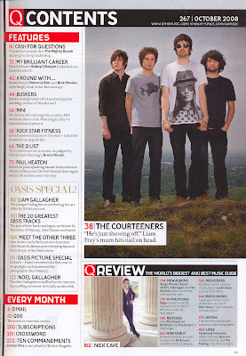 In evaluation of my final product "Strain", in comparison to others such as NME, Kerrang and Q; all magazines within my alternative genre, so I find that I stick to my idea that my magazine should be produced by a mass production company just as the examples are, by a company like IPC Media. The reason for my belief that my product could be produced as a mass product is due to the fact it contains mainly similarities with other magazines like Q, one reason being the use text within my product, within my product I include a variety of pieces of writing such as an interview, review, contents and front page one liners, just as a major magazine like Q (contents page, above.) would. Another reason for my belief that my magazine should be marketed as mass media, is due to that has such an expansive audience, it is not just targeting a small audience like indie magazines. Lastly another reason for my continual belief in my product being similair to that of ones such as Kerrang, is the physical similarities between the two, they use many of the same colours, such as the main being black and white, but red and blue as well, all within my product, they also use they same layout and similair looking images, which is shown in detail in evaluation one.







 In design -
  Photography -

